From Settings to the Map: Putting Territory Context Where Users Actually Live
At SalesRabbit, I led end-to-end design for map overlays, a feature that lets customers layer contextual data like serviceable territories and historical weather onto their maps. It shipped in November 2025 as a committed dependency for the company's largest account and is now active across 21 SalesRabbit+ accounts with around 200 overlays uploaded since launch.
Problem
Reps were planning without the data they needed
SalesRabbit's enterprise customers in telco, roofing, and security send thousands of reps into the field daily. Without contextual map layers like serviceable territories, weather history, and geographic boundaries, reps couldn't prioritize where to work from inside the product. They were either guessing or toggling to external tools.
For SalesRabbit's largest account ($19.8K MRR, ~2,300 users), map overlays were a dependency for completing their platform migration. Across the premium tier, 218 of 590 customers operated in segments where overlay data directly shaped rep routing.
This wasn't a nice-to-have. It was infrastructure for SalesRabbit's highest-value segments.
My role
1. Led end-to-end design for web and mobile, from discovery through handoff.
2. Conducted discovery interviews and usability testing with customers across telco and roofing.
3. Partnered with PM, two frontend engineers, one backend, one mobile, and QA.
4. Worked through technical trade-offs with engineering to balance functionality and performance.
Context
A renewal deadline, not a roadmap item
Sector, SalesRabbit's largest customer, had threatened not to renew in December 2025 unless they were migrated to SalesRabbit+. The company committed to their terms, and map overlays became one of several migration dependencies. Sector operates 8 international offices, each with its own workspace migration. Four are now complete, and the rest are rolling through one by one.
My feature needed to be solid before that migration could proceed.
Research & Insights
What 4 customers taught me
Going in, I had two assumptions to validate. First, that users would only need to view one overlay at a time. Second, that most users wouldn't know geospatial file types like KML or KMZ, so onboarding would need to educate them.
Both were wrong, and in opposite directions.
"It feels intuitive. I like how straightforward it is."
Tyler, Tree Removal
Users were fluent in these file formats. No education needed. But they absolutely needed multiple overlays visible at once. Telco reps described layering serviceable territories over geographic boundaries. Customers said 2 to 4 overlays at a time was the baseline expectation.
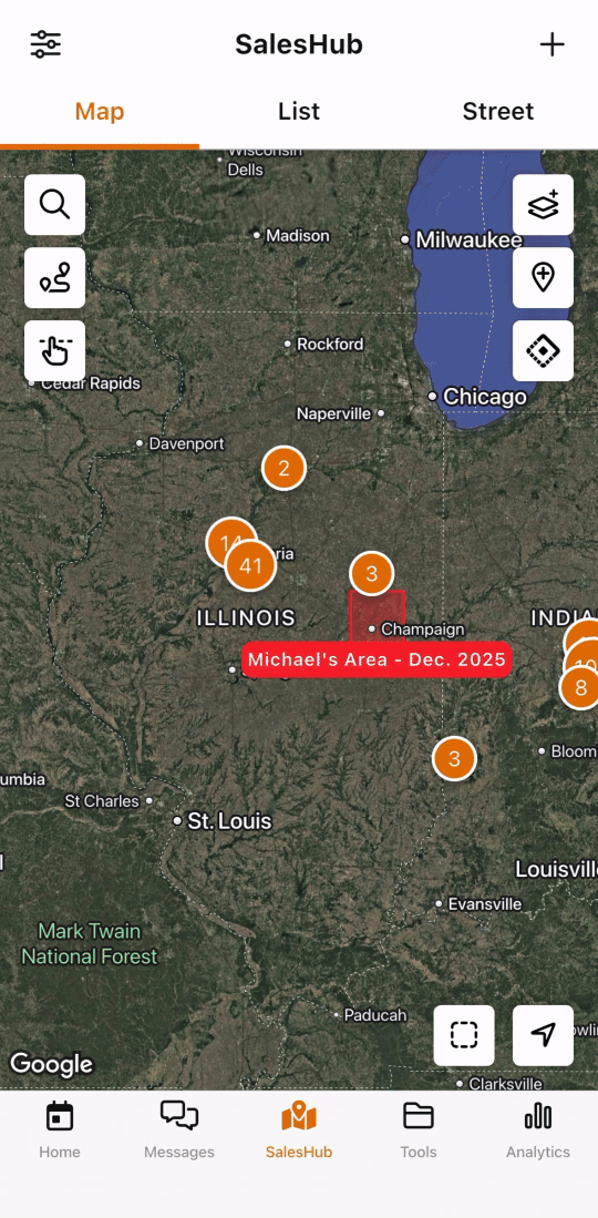
That finding created the central design tension: give users the multi-overlay functionality they need while protecting app performance, especially on mobile.

Process
Using AI where it helped, pivoting where it didn't
I tried Replit and Figma Make early on to prototype the overlay experience for testing. Both struggled with the thing this feature depended on: rendering a real map with layered overlays. The AI-generated prototypes couldn't hit the interaction fidelity I needed, so I pivoted to Figma. Knowing when to abandon a tool saved time I would have lost troubleshooting.
Where AI earned its place was in UX copy. SalesRabbit has a custom ChatGPT writer trained on our voice, and I used it to draft and refine microcopy across the overlay experience, including the mobile performance warning. It kept the copy consistent and sharpened edge-case messaging without me context-switching between designing and writing.
Solution
Designing around constraints, not against them
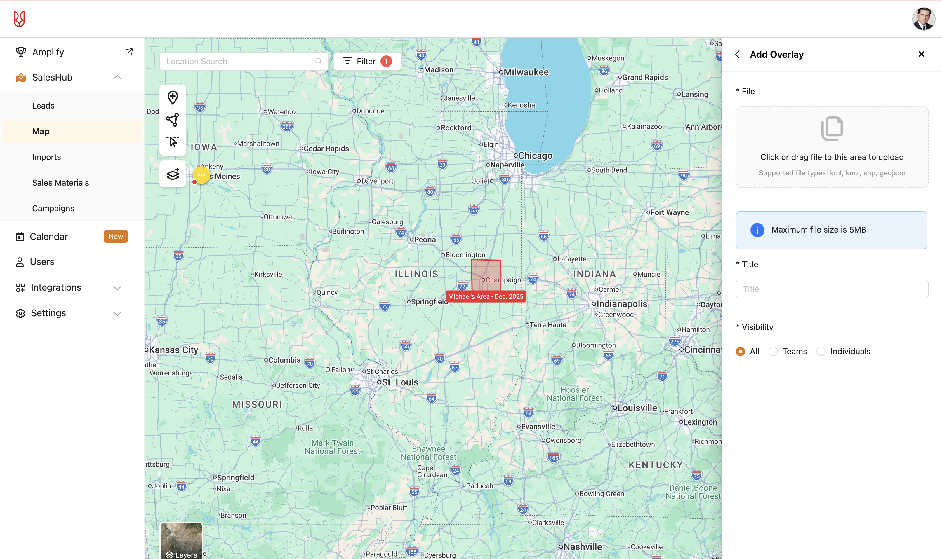
I explored three directions: restricting mobile to a single overlay, a toggle-based system for activating overlays individually, and adding descriptions to disambiguate generically-named overlays (like "Overlay #1").
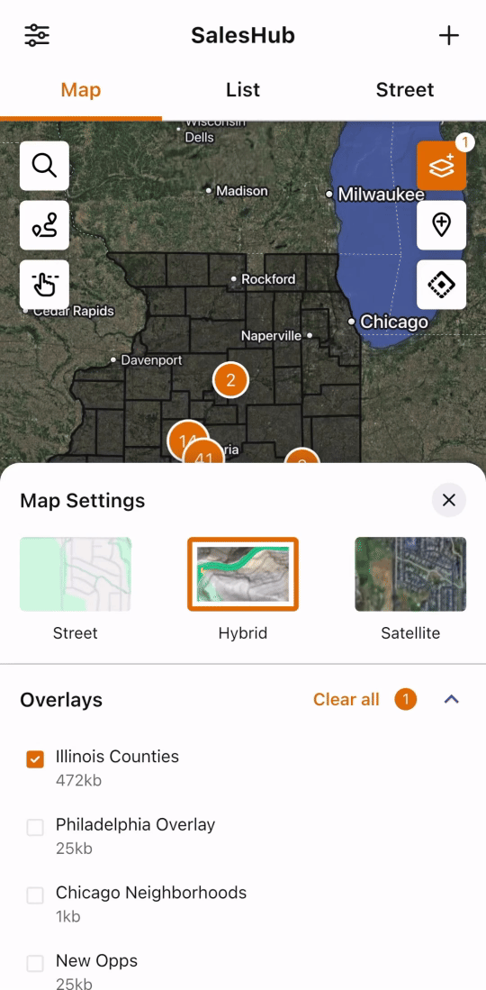
Testing with 3 customers and 4 internal employees sharpened the direction. The description field cluttered the interface without adding value, so I cut it. On mobile, working with engineering, we landed on a cap that allowed multiple overlays while protecting performance, paired with a warning when users approached the limit. The warning turned a technical constraint into a user-informed choice rather than a silent failure.
Two features tested well but got cut for timeline when priorities accelerated: search and filter, and converting an overlay into an area. Both were explicitly deferred rather than dropped.
Before
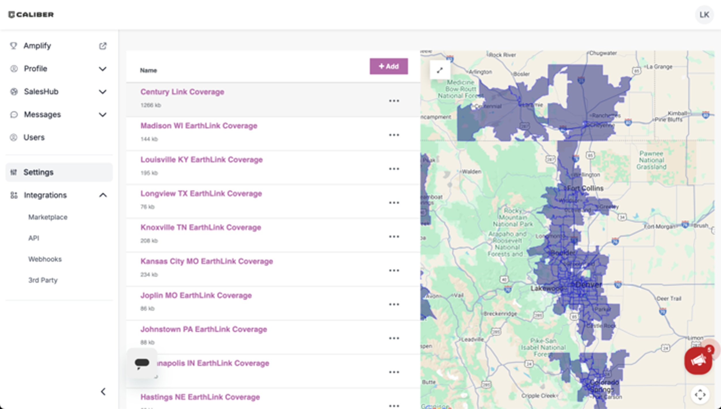
After
Changes made
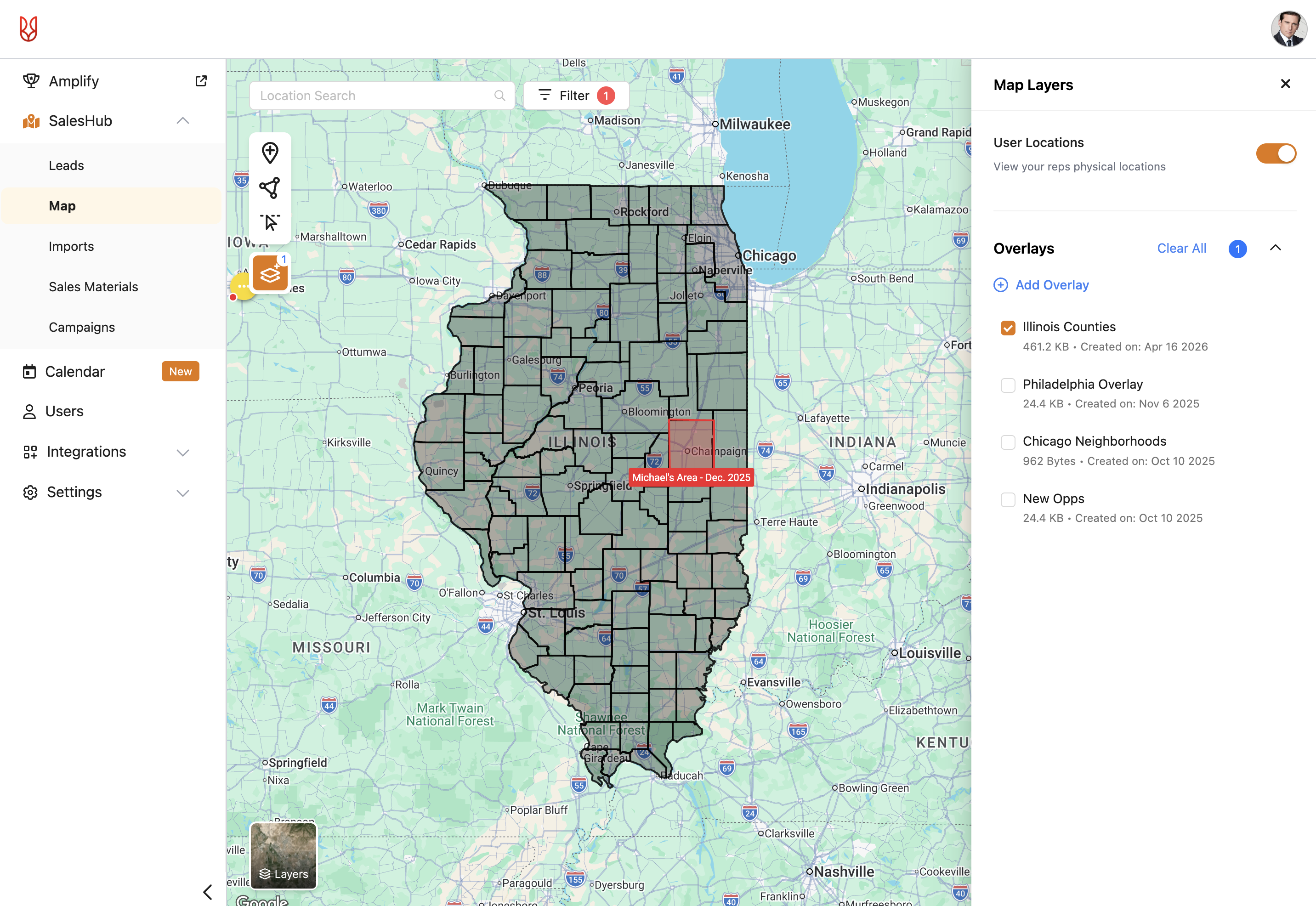
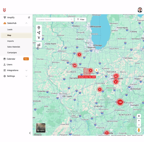
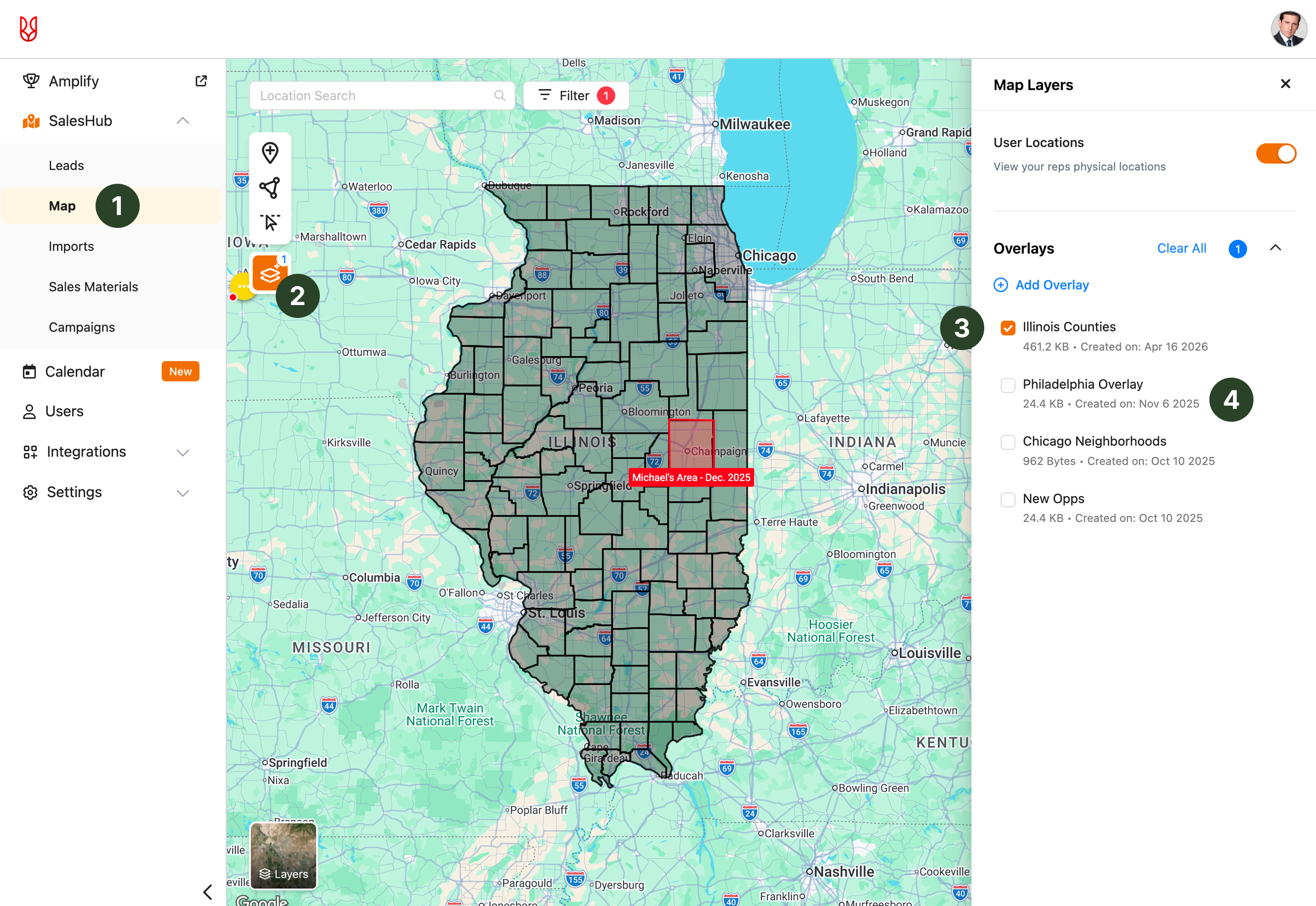
- Moved the feature to the SalesHub map from the settings, where field sales users live.
- Grouped map overlays with other map features, creating a more intuitive experience that aligns with users' mental models.
- Users can now have multiple map overlays on at once, a need discovered in research.
- Added the date uploaded and the ability to edit the overlays, helping with scannability and further customization.
"I think the positioning of it looks good. How you're adding them in and pulling them up."
Cordero, Roofing
Impact
Shipped on time, as a migration dependency
Map overlays shipped in November 2025 and is now available to all SalesRabbit+ customers. Early adoption data shows 21 accounts have uploaded around 200 overlays since launch, an active-investment signal in the window before broader migration from SalesRabbit to SalesRabbit+ kicks off. Comprehensive usage tracking is still being instrumented.
What I can speak to is the business context. Knowing map overlays would be available in SalesRabbit+ was a factor in Sector's decision to migrate rather than churn. The feature is also available to the 218 SalesRabbit+ customers in segments where overlay data directly shapes rep routing.
The bigger de-risking moves happened earlier: validating that multi-overlay support was a real need, retiring the assumption that users needed education on file types, and landing a performance-protective limit with engineering that didn't feel restrictive.
Reflection
What I'd do differently, and what this taught me
With more time, I'd push back on the decision to descope analytics tracking. Shipping without a measurement plan means the team loses the ability to learn from the feature in production. That cost compounds.
The next iterations I'd advocate for are search and filter (already tested well) and converting overlays into areas (a multi-year customer request).
The bigger lesson was about field sales users specifically. These are people on the go, making decisions in minutes between door knocks. The original concept buried overlays in settings.Moving the feature onto the map itself, where field sales users live, was the single most important simplification of the project. It reframed overlays from "a thing you configure" to "a thing you use."